

Fabric District
For this rebrand project I was tasked in developing a refreshed place-making brand identity for the Fabric District which reflects the areas own identity and life. This entailed re-establishing what makes the district different and unique from existing areas such as the Baltic Triangle and Bold Street.
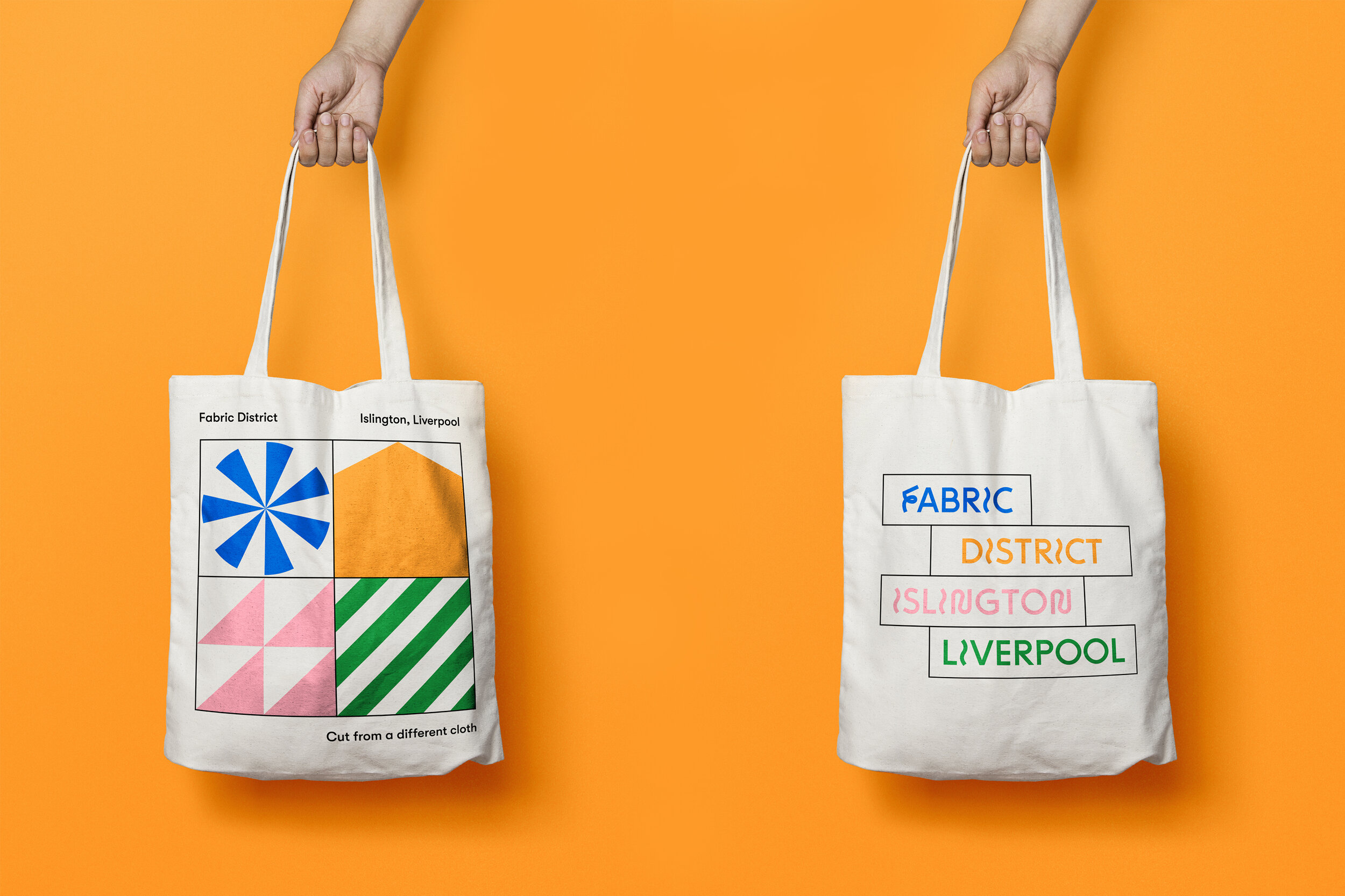
The most prominent and longstanding themes of the district have been those relating to fabric and fabrication, hence making Islington the historic Fabric District of Liverpool. The identity reflects the industrious heritage of the area with a fresh and unique look and feel to attract a diverse audience back to the area, all whilst retaining the spirit and attitude for existing businesses to thrive.
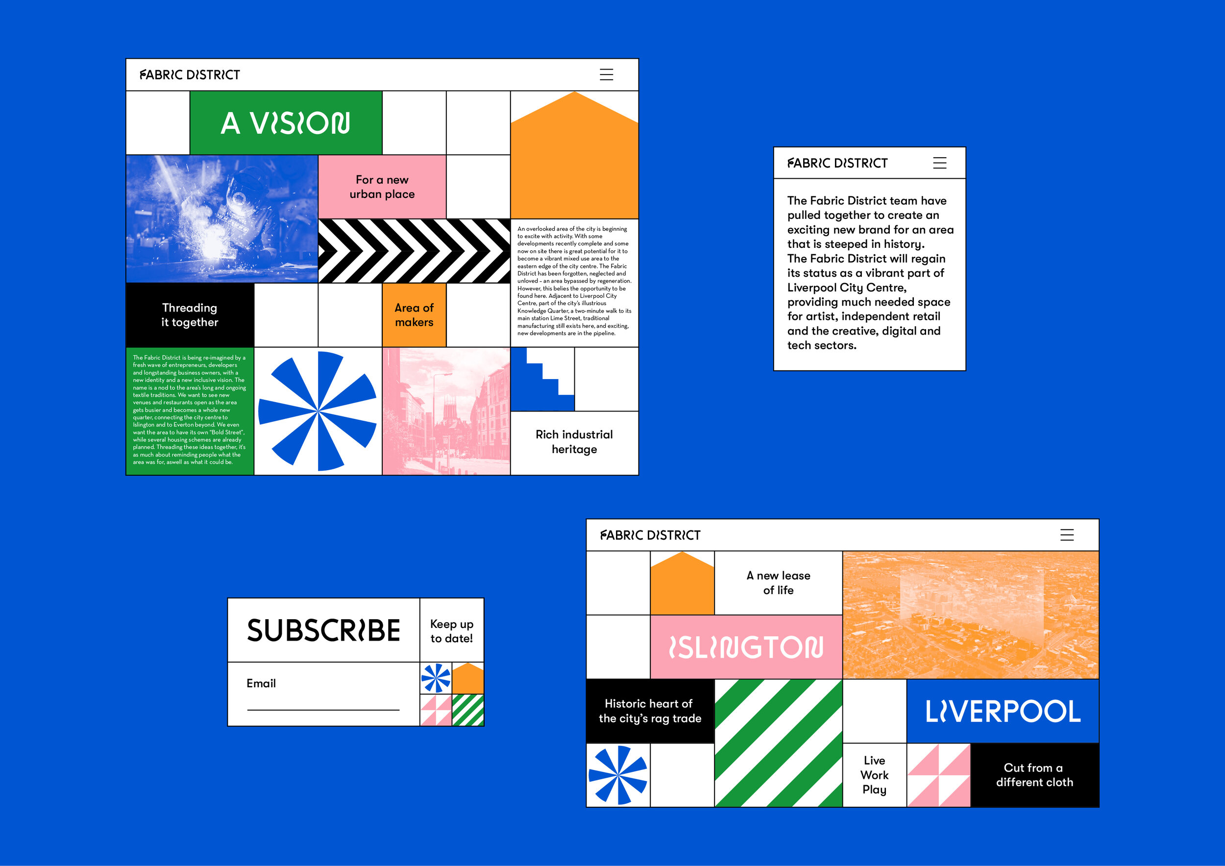
Visual Mapping of local businesses


Industial-esque grid system
Regeneration is as much about reminding people what the area was for, than what it could be. A key priority for the rebrand is to support the makers and manufacturers long established in the Fabric District, this inspired the identities look and feel for the brand.
Utilising the identities industrial style grid, local and upcoming businesses are taken along a journey in the style of visual maps and a concertina brochure. The adaptable grid system allows icons, colours, and type to be juggled around to suit different topics and businesses.


Fabric District Identity Toolkit
