KA Drinks
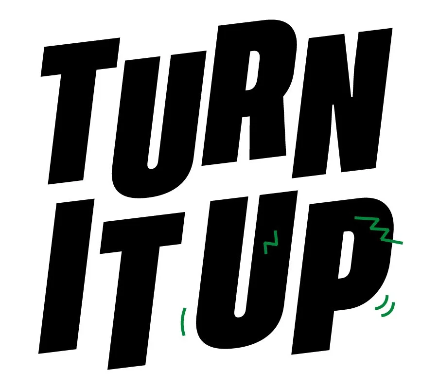
Turn It Up
KA Drinks came with the brief to develop a POS kit which would resonate and be more in line with their campaign of ‘Be The Noise’ on a shopper level in order to drive pick up at point of purchase for KA.
KA is a British brand with Caribbean heritage. KA is firmly cemented in city culture, this is expressed through everything they do. KA is seen by consumers as an authentic Caribbean brand that is part of street culture and urban communities, this stems from it being deeply rooted in communities with high ethnic diversity. It is heavily linked to consumers’ moments and memories, it is more than a drink to them and they attach positivity to the brand due to its links with socialising with friends, their youth and events like Carnival and street parties.
Their key target audience are 16-25 year olds who live in multicultural city environments who are heavily influenced by urban culture which manifests through their choices from fashion to career ambitions to soft drinks- KA is apart of their world.
INITIAL CONCEPTS
INITIAL CONCEPTS

Concept 1
Dive into a summer celebration, bursting with bold colours, eclectic shapes, and an irresistible carnival spirit. Drawing inspiration from the Afrobeats style, the graphic pattern radiates vibrant energy and positivity. The hero pack shots shine with bespoke patterns and summery shades, celebrating individuality and inclusivity. Prepare to bask in the joyous festivities and embrace the KA way of life.


Concept 2
This visually captivating design fearlessly commands attention, embodying the essence of the 'Be The Noise' campaign and interpretation of 'Turn up the flava'. The bold and striking typography exudes confidence and attitude, making an unmistakable statement that represents urban street culture. Get ready to awaken your taste buds and turn it up with KA Drinks.


Concept 3
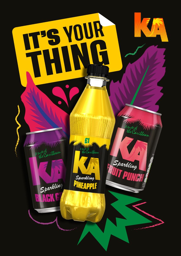
KA is not just a drink; it's a brand that embodies unforgettable moments and cherished memories. Celebrate individuality and the vibrant spirit of urban street culture. Express your true self without inhibition, embracing creativity and authenticity in every sip.
A vibrant explosion of carnival and street party vibes, KA delivers a burst of positive sunshine straight to your tastebuds. Experience the joy and energy that KA brings. It's time to do your thing.


DEVELOPED CONCEPT
DEVELOPED CONCEPT
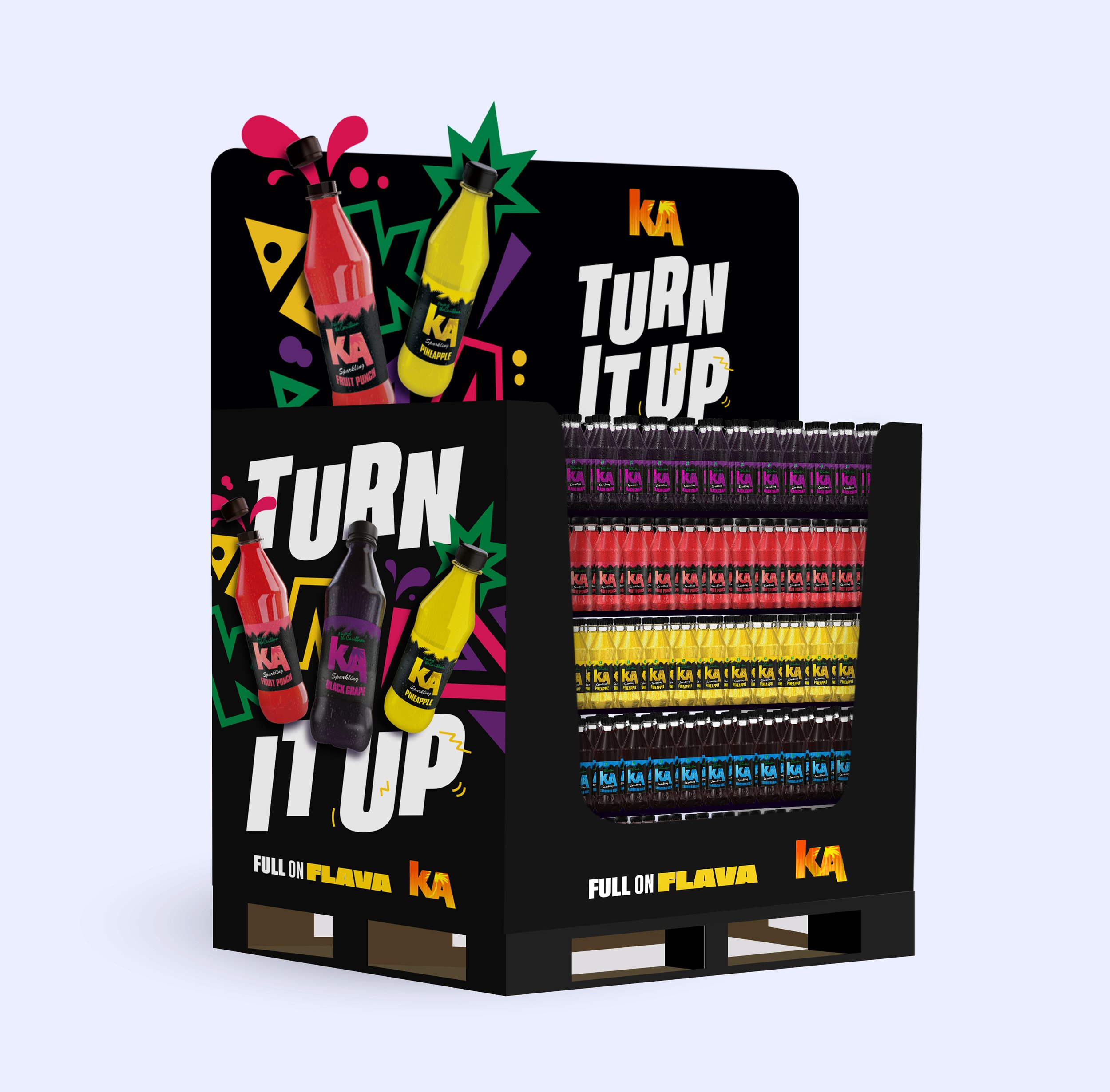
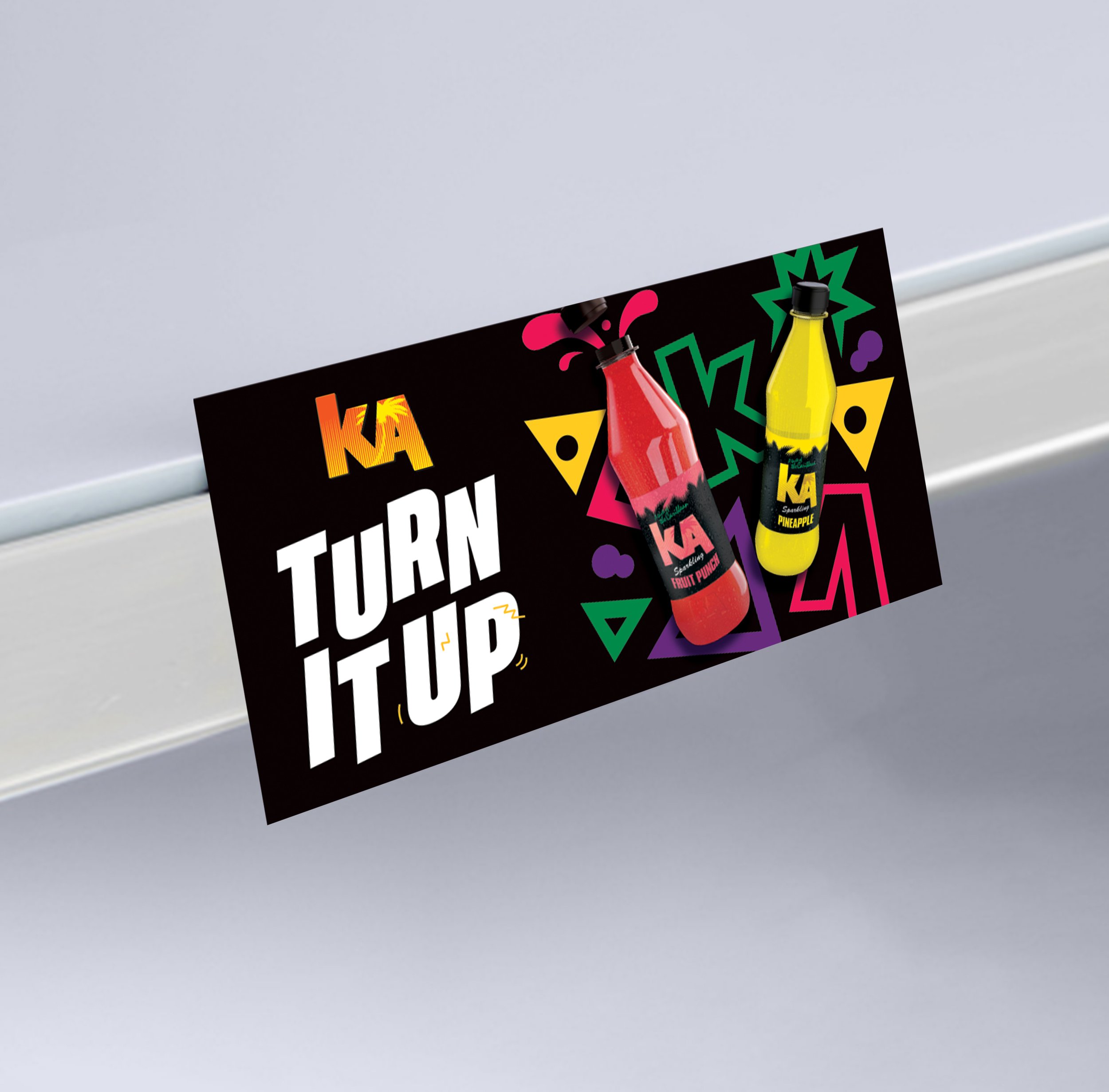
Listening to feedback, KA wanted a combination of the concept elements to inspire a developed KV. The range of afrobeats inspired patterns feel right for KA, but they wanted more movement in the background with shapes interacting with the bottles. This is KA drinks, redefined and screaming even louder.
Key Visual
The 'Turn it up' lock up packs a punch on its own or seamlessly integrates into the main visual. Altered pack renders, typography and graphical cues combine to create a dynamic representation of sound.
The radiant Afrobeats inspired pattern not only exudes positivity but also gives a nod to the culture at the root of the brand. Whilst the pattern has been toned down it still remains a key design asset. Playful elements like bubbles, splashes and flavour cues add a fun touch.
The visuals prominently showcase the core 500ml bottles, enhanced with water drops that bring a refreshing and enticing summer sparkle. The bottles overlay the white headline to enhance shadows and contribute to the design hierarchy.
‘Full on Flava’ sign off at bottom brings together the messaging and helps with overall balance.